Blog
The Fireplace Dilemma
A common design problem these days is the fireplace/TV debate. Our first house was a tract house we had built in South Carolina. We did not put a fireplace in that house because I preferred the extra window that came in it’s place and we didn’t want to pay for something we would barely use. The house we just sold was a builder spec house with a gas fireplace. We turned it on a couple times the first winter, but shut the gas off to it once The Kid was tall enough to reach the switch to light it. It was never used after that. The mantle over it was over 5′ off the floor, so watching a tv above it would have been painful with the center of the television being over 6′ up. We ended up mounting the tv to the adjacent wall which left us with only one way to arrange the furniture without blocking the tv or fireplace. We have the same setup in this house we are renting although the tv is on a stand instead of mounted to the wall. The fireplace mantle is a little lower in this house, but still too high to put a tv over it. We also shut the gas off to this one shortly after we moved in because I didn’t like having the pilot light burning all the time and we still don’t trust The Kid to not play with the switch.
Our new house has the option of having 3 fireplaces – the study, master bedroom and family room. We don’t really want to waste the money or space on fireplaces in the study or master bedroom. I’ve went back and forth on one in the family room though. For a long time, I had decided to not have any in the house. I am concerned about building a house of this size without a fireplace since it seems to be something that is almost “required”. We had complaints while selling our first house about the lack of fireplace and it was much smaller than the one we are building. We plan to stay in this house for as long as possible, but resale will someday become an issue. Although we live in a fairly warm climate, almost every house has a fireplace.
The question has been how to fit a fireplace in a room that will be primarily used for watching tv. I’ve seen built-ins where either the tv or fireplace is centered on the wall while the other is off to the side. While that allows the tv to be hung lower, I feel it often looks like one was added later as an afterthought (we’d also want the tv in the middle which I think makes it look even stranger). I had seen this design below by Candice Olson a while back and thought we may be able to come up with something similar.
I really like the more contemporary fireplaces with glass rocks instead of logs. They also tend to be more rectangular and not as tall. Then, I recently came across this picture below and it’s exactly what I was looking for.
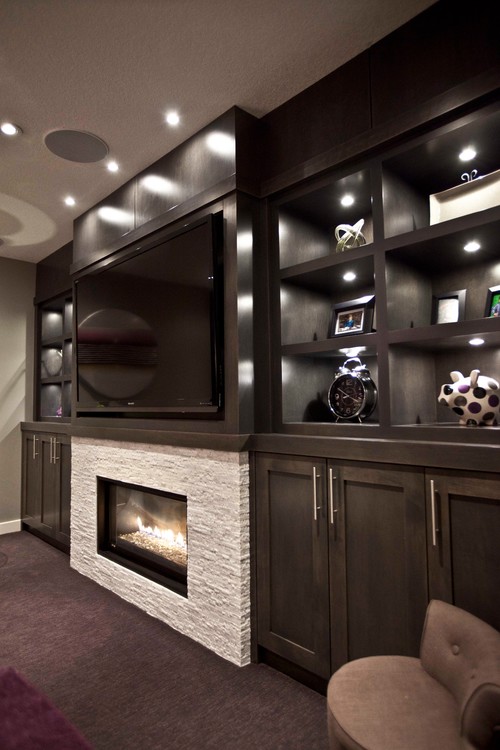
Image via Houzz
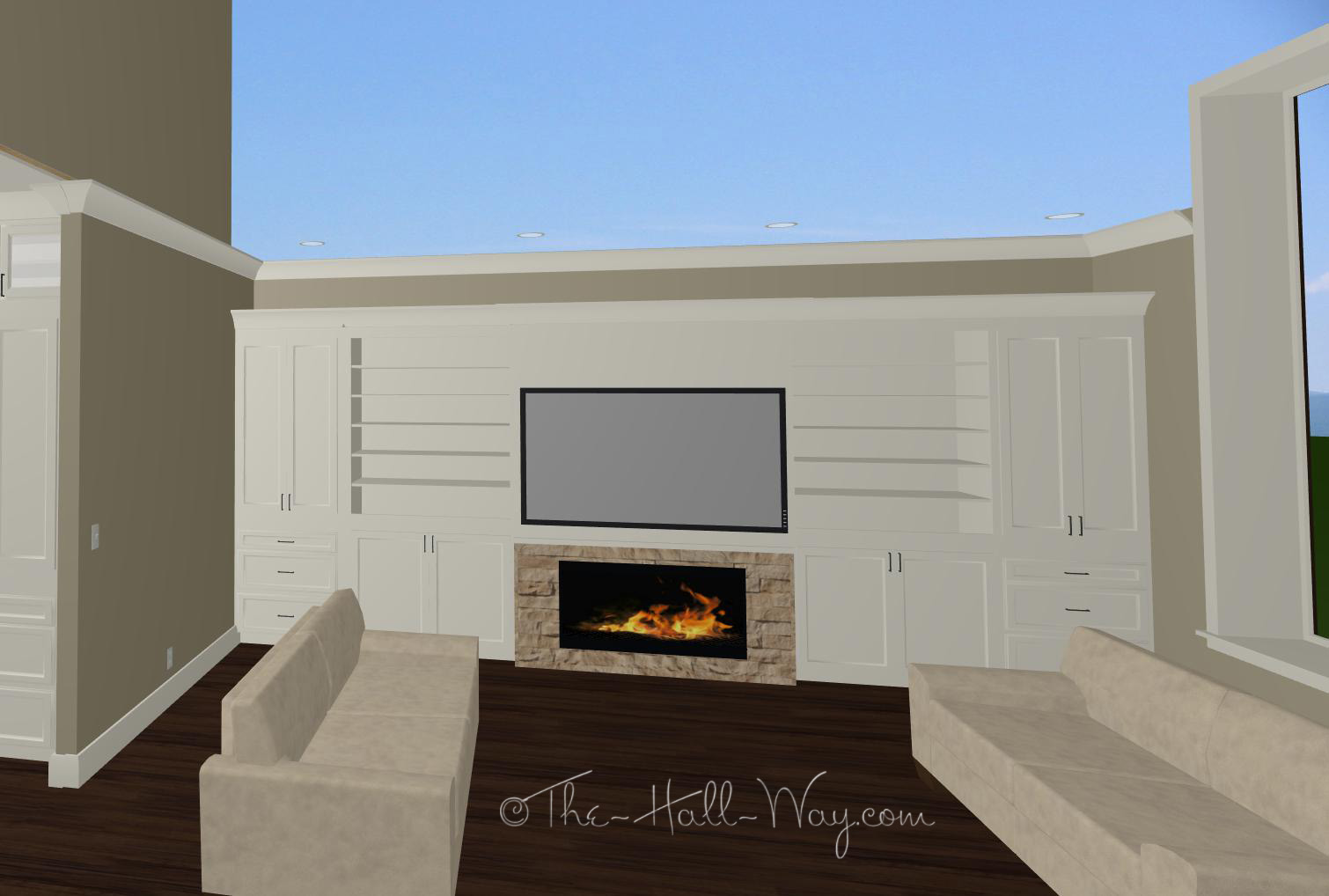
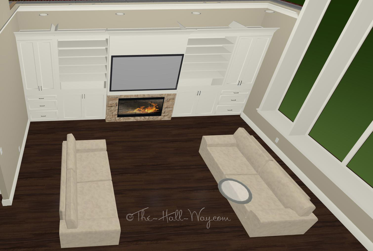
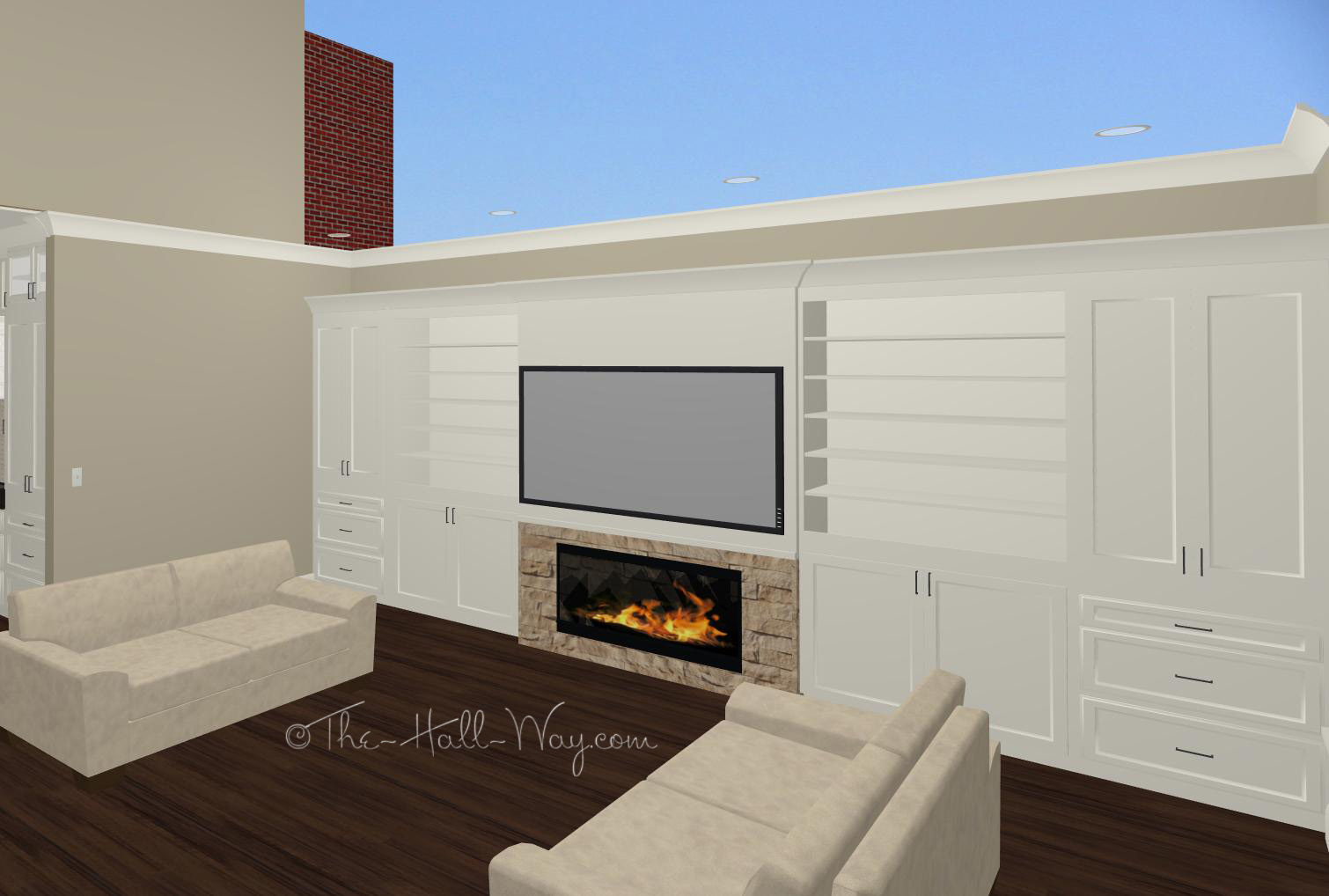
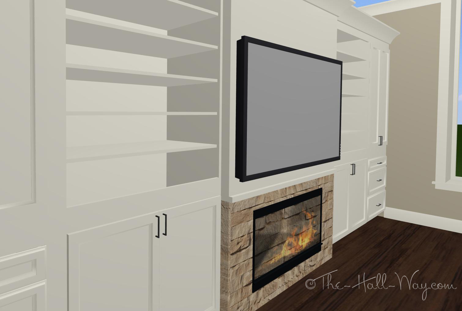
I love almost everything about it. Both the fireplace and tv are centered, but they are not really competing with each other. The tv is low enough to watch comfortably and everything goes together well. Yesterday, I went into my program to see if I could come up with something similar. Our wall is several feet longer than the one above, so I have a bit more room to work with. I’d like to have a combination of open shelves and closed cabinets. Below is what I came up with.
It’s not perfect, but it’s much better than I had before. (This room will have a vaulted ceiling which is not drawn). I need to mess with the widths of the cabinets some more. The satellite receiver and other components will be be hidden in the cabinets with a remote eye mounted somewhere so the remotes will work with the doors closed.
I drew the tv as a 70″ ( ;P ) and the bottom is about 40″ off the floor. I compared that to where our tv is sitting now and it’s not too bad. I’d like it to be high enough to see from the kitchen and dining area as well, but not too high for watching from the couches. One difference between my design and the inspiration above is the cabinet color. I’ve been planing on painting them white to match the perimeter kitchen cabinets, but I like how the tv blends in better on the stained cabinets. We could stain them to match the island, but that bring up the issue of what color end tables and such to use around the couches. I prefer the idea of the white because it goes with whatever the rest of the furniture is.
Mexican Bean Dip
I was looking online for one our favorite recipes and wasn’t able to find it. I really didn’t find anything that was even close, so I thought I’d post it on here. My mom originally put it in our church cookbook many years ago and we have made it numerous times since we’ve been married.
Mexican Bean Dip
1 lb italian sausage
1 lb ground beef
1 lb colby cheese
1 can chili with beans
2 cans refried beans
1 can tomato sauce
1 can jalapeño relish
2 packets taco seasoning
Brown meats and drain off fat. Put meat and remaining ingredients into a large crock pot. Cook slowly for ~2 hours and serve with tortilla chips. May be frozen and reheated.
We run sliced jalapeños thru the food processor for the jalapeño relish. The amount can be adjusted depending on how spicy you want it. It’s great for parties or reheated later for lunch.
Finalizing The Plans
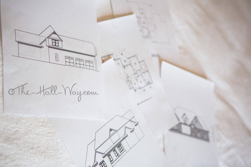
It took over a month, but we finally had our meeting with the draftsman yesterday. I had marked up all the plans and elevations on Friday, so we spent about 45 minutes yesterday going over my notes. Most of the remaining changes are minor- outlets, window and door sizes, etc. The biggest issue that remained was the staircase. I wanted 3 windows across the middle section of the front of the house, but the staircase was too low for one of the windows. 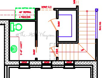
It’s right in the center of the front elevation, so leaving one of the windows out was not an option. We had thrown around options and the only good one so far had been to pull the staircase away from the exterior wall by 1 foot. That would trade a foot of pantry space for a foot of wasted space, but would allow us to keep the exterior looking the way I envisioned. We weren’t thrilled with that idea though. Yesterday, we suggested adding one more step at the bottom of the stairs (there is room, you can see in the drawing above), then moving that exterior wall out 1 foot. That makes the first flight of stairs longer and makes the second flight high enough to go over the window. It should also keep the staircase from encroaching into the ceiling of the hallway. It adds some square footage to the house, but I think it is our best option for the interior and exterior.
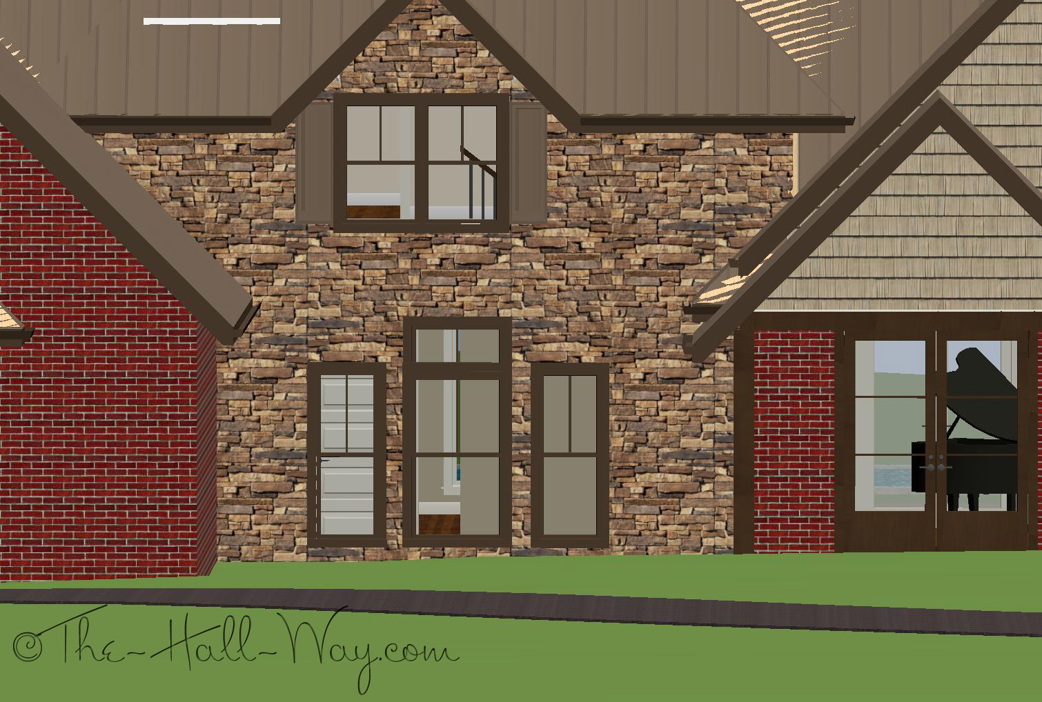
When we got home, I went into my program and messed around with the windows to try to get the look I wanted. Below is what I came up with (ignore the crazy roof lines and off-centered upper window – just look at the 3 windows on the bottom). We got an email yesterday afternoon from the draftsman saying that our idea worked and he is able to make the windows look how they are pictured below. I’m very glad to have that taken care of.
Meanwhile, he has one of his assistants working on the rest of our changes and will have the lumber company start on the framing plan next week. We should have the final plans finished in the next week or 2 (although it has taken us almost 5 months to get to this point, so we’ll see). He should be able to give the builder enough of the plans to start working on our final estimate next week. We knew there’d be delays in the building process, but we didn’t think it would be before we ever signed the building contract or applied for the loan ;P
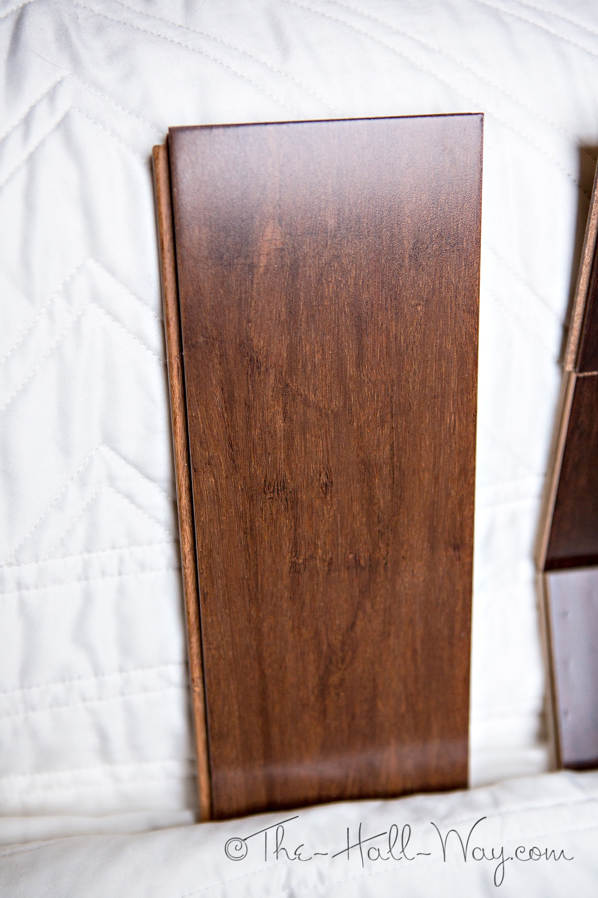
I’ve also been looking at options for our wood floors. Here is the sample I have of the Maduro Bamboo from BR-111. It’s showing up a little redder on my screen than it is in person.
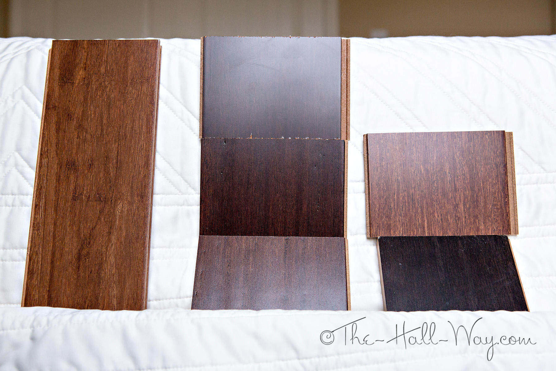
I also grabbed a few bamboo samples at Home Depot last week. Below on the left is the Maduro Bamboo, Home Legend Strand Woven Bamboo in Walnut (Handscraped and Smooth) in the middle, Home Legend Strand Woven Bamboo in Sapelli on the top right, and Home Legend Strand Woven Bamboo in Espresso on the bottom right. They are all slightly darker than they look in the pictures (the espresso looks solid black).
I think the Maduro on the left is still my favorite. The walnut bamboo is a little too dark, the Sapelli is too red/pink and the espresso is way too dark and uniform.
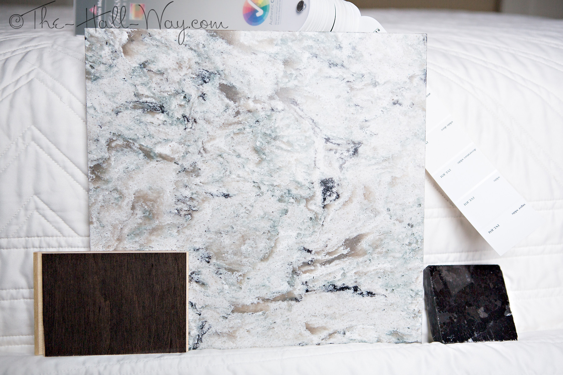
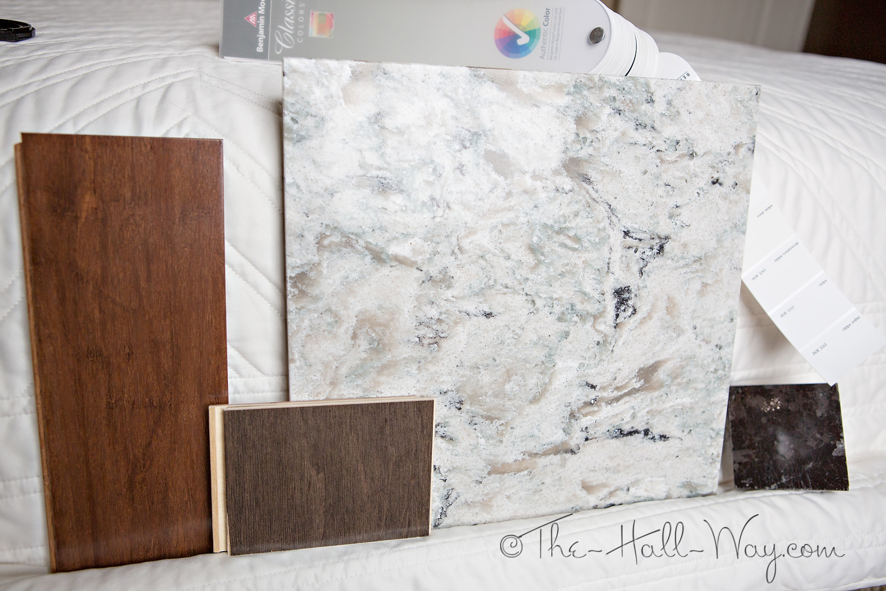
I also came across a Platinum Maple flooring sample which is a similar stain to what I am thinking about using on the kitchen island. The picture below shows it next to my top choice for the island countertop (Cambria Praa Sands). On the right is a sample of Antique Brown granite with Benjamin Moore white paint chips above it – my current selections for the kitchen perimeter cabinets.
Here’s another picture with the Maduro Bamboo sample included. This picture is a little too light – the one above is more accurate.
It’s The Most Busiest Time Of The Year
It’s been a busy and hectic month for us. We’ve known for a few months that our almost 13 year old Lab was not doing well. We finally decided it was time to let him go after Thanksgiving. The weeks leading up to it and since have been hard. We got him on our first anniversary and he was our Best Bud.
David finally got off the night shift, but they are still keeping him really busy at work. We spent a couple weeks going back and forth with the draftsman and builder on our plans in the meantime. The Kid and I were both pretty sick last week which really threw everything off. I hadn’t even started Christmas shopping as of last week and our tree sat half decorated for a couple weeks. I’m slowly getting caught up, but I don’t think things are going to slow down until after New Years. To add to the chaos, we went to get a puppy last week and ended up with 2 new dogs. We had wanted a male puppy, but they also brought out a 4.5 year old female who we really connected with. They ended up offering us Goldie if we bought the puppy and we decided to go for it.
She is really well trained, sleeps most of the time and made herself at home right away. She has a sweet personality and is pretty funny. We picked up the puppy a week later and he’s kept me on my toes since. 
He’s also a sweetheart. We didn’t want 3 dogs, but our Mastiff is 10.5 years old and we know our time with him is also limited. Our original plan was to adopt rescue Mastiffs next, but I had begun to change my mind over the past year as I’ve watched our boys age. I fell in love with Bulldogs a few years ago and decided it was time to go with a smaller dog. Several aspects of our new house have been designed with our dogs in mind, so the decision to not have giant breed dogs affects that somewhat. Most things can stay the same no matter how big the dogs are (dishes in the mud room with tile floors, built in dog food storage, etc). One thing we are looking into changing is our wood floor selection. We’ve been planning on Brazilian Walnut because it one of the hardest woods and one of the few that can hold up to 150+ pound dogs. It’s also one of the most expensive and putting it throughout the majority of the house was going to be a large expense.
Once we decided to get the Bulldogs, I started looking into other options for our wood floors. I still want something extremely durable. Most woods that are lower than Brazilian Walnut on the Janka scale have a reddish cast, which I don’t want. We have started to look into bamboo. There are several different types of bamboo flooring – some aren’t much harder than red oak. We are looking at strand bamboo which can be almost as hard as the Brazilian Walnut. I actually have a sample from BR-111 which I really like.
It’s a similar color to the Brazilian Walnut and it’s about 1/2 the cost. After things settle down, I want to see what other options we have, but I think we can find a bamboo we really like and save quite a bit of money in the process.
We received another draft of our floor plans and elevations last week from the draftsman. We are getting a lot closer to being done with them. We were going to meet with the builder on Friday to go over them, but work and sickness caused us to cancel. We are to the point now that we need to meet with the draftsman in person to finish up the last details. I’m not sure when we’ll get to it between the holidays and David’s work schedule. We may have to wait until after New Years. Hopefully, then, we can get the plans finalized and apply for the loan. I’m very anxious to get started!
In the meantime, from our family to yours, we wish you a Merry Christmas!
Elevations And Renderings
We finally got the first draft of our elevations this week. I had been worried about how they would look, but they look pretty good. Most of what needs changed is minor and, hopefully, he can start working on finishing them up now. We may meet with him and the builder next week so he can work on them with us all there for input. He also sent us the electrical plan. I need to look over the details, but it’s pretty similar to what I had sent him. I need to spend some time making sure everything is where we need it, but I’m not to worried about it. As long as the plans are close, we should be able to adjust the exact locations on site.
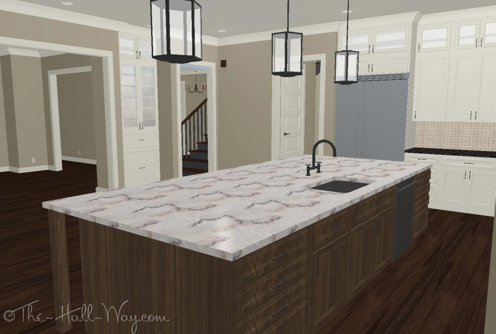
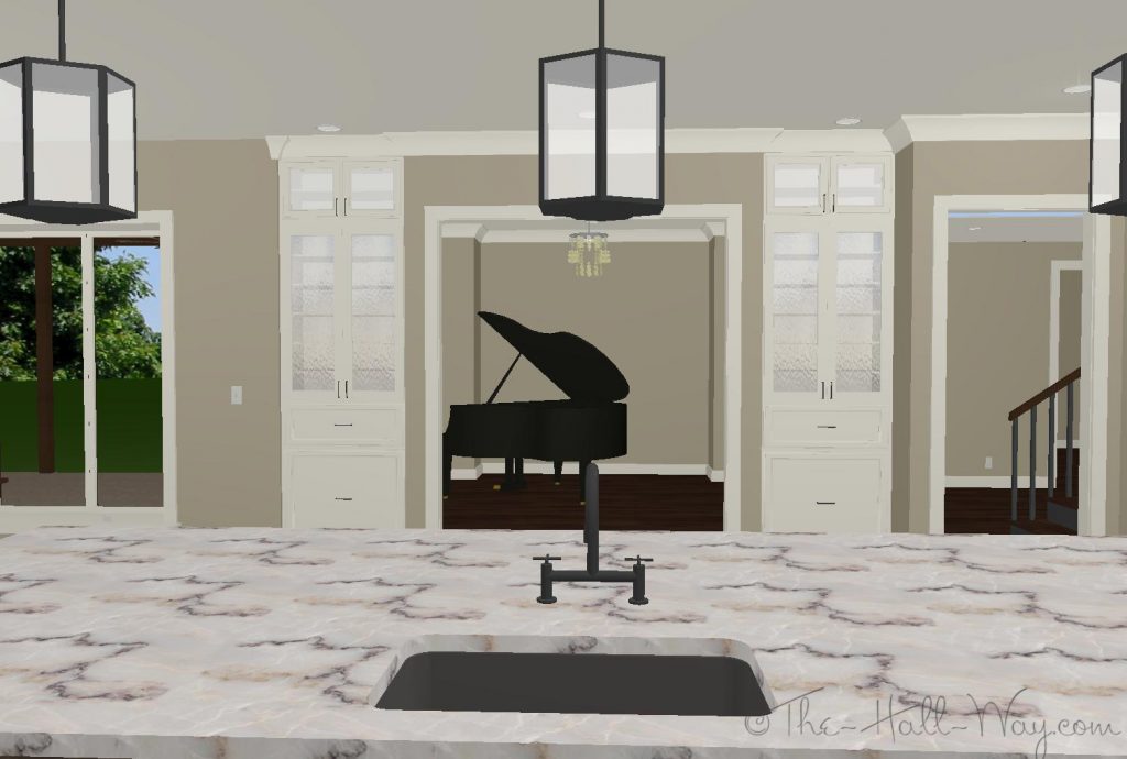
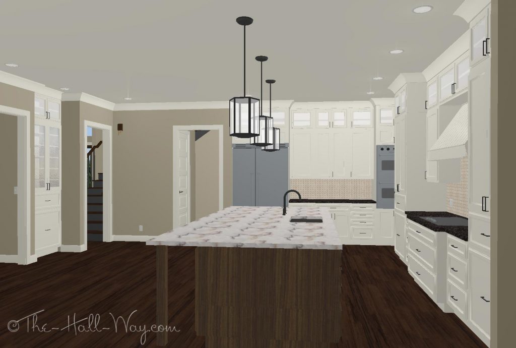
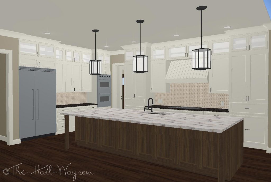
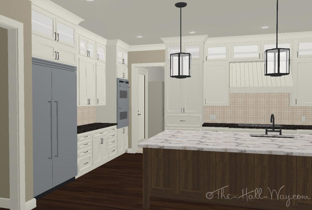
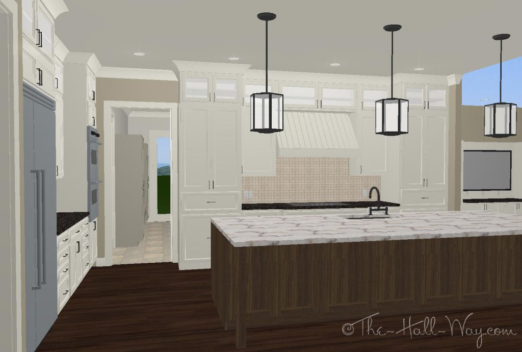
Yesterday, I spent some time working on the kitchen layout in my program. I tried to make it look as close to how I want it as possible although some things still look odd because of the limitations of my program.
All the fixtures and hardware are supposed to be polished nickel, but for some reason, the program renders them black which I don’t like.
Originally, the ovens were on the far right of the cooktop. We will probably have the microwave above the wall oven and that seems far from the fridge to me. (We will move things from the fridge to the microwave more than we will from the stove to oven.) We could move the microwave/wall oven to the left of the stove, but I don’t think that will look right. I decided to try moving them to the corner on the wall with the fridge and I think I like that better. We can use the counter between them or that end of the island for baking. It’s still not too far from the cooktop, when needed.
The mud room is through the door straight ahead. The doors to the garage and laundry room are just on the other side of that doorway. I don’t have a roof on this version which is why you can see the sky on the far right.
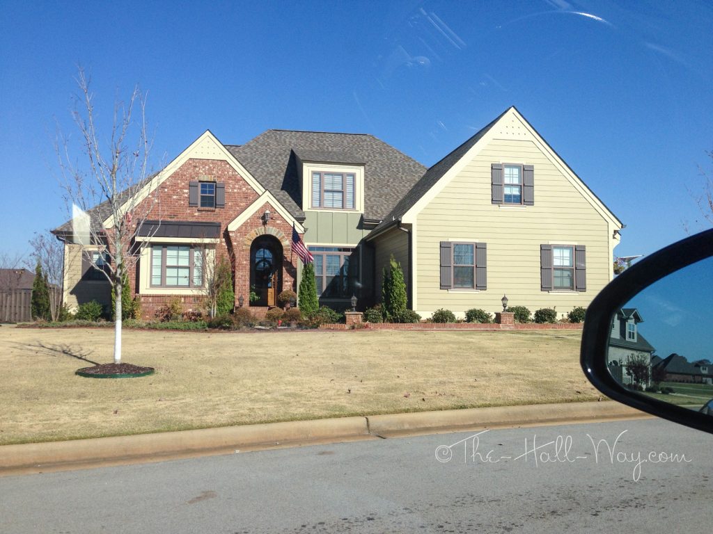
Today I drove through a neighborhood of craftsman style houses similar to how I want ours to look. I wanted to look at the brick colors and window styles. I really like the brick on this first house and the other colors are not to far from what I want to use on ours (will probably go a little darker with the paint though).
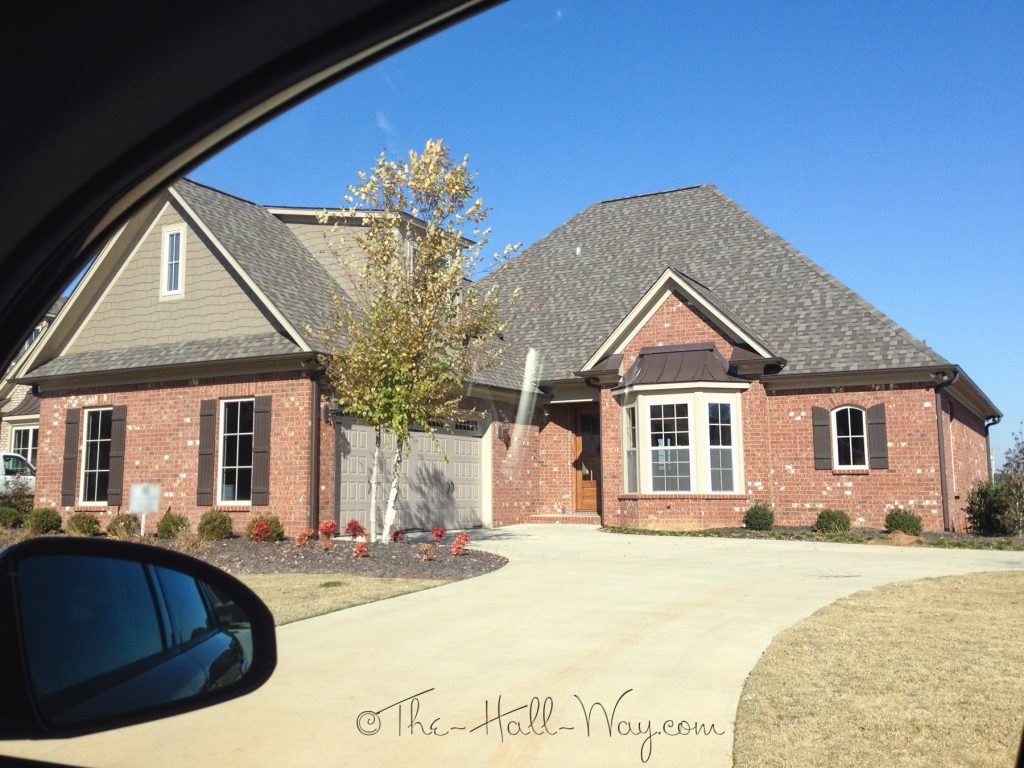
I think the brick on this one might be the same. Also has a similar green on it. I know who the builder of these houses is, so I may be able to find out exactly what brick was used.
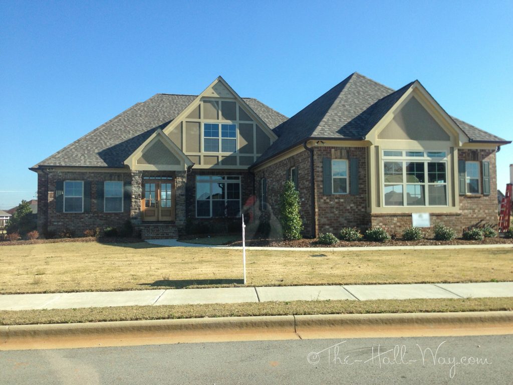
This also has green on it, but the brick is less red and has more variation. Another possibility . . .
I’ve been trying to figure out what to do with the windows. I hate grills on the windows because they interfere with the view and make the house feel more closed in. All of our houses have had the Colonial grills (see below). We are always surprised when we walk into a house without grills because it feels so much brighter and more open. I know for sure that I don’t want any grills on the back or side windows. Our current design has grills on just the top pane like the Half Colonial below. I’m leaning towards changing it to the Three Over One or Two Over One for a simpler design.

The windows on the front of the house aren’t ones we will spend a ton of time looking out, but they will be our view to the street and driveway. Another consideration is that the house will be almost 200′ from the road and the windows will be Low-E which makes them reflective, so the grilles might not even be noticeable from the street anyway. If that’s the case, we could possibly just leave them all without grilles. I need to keep looking when I drive around to decide what will look the best.


