Blog
Eastover Cottage – The Master Suite
In continuation of our Southern Living Eastover Cottage tour, today we’ll take a peek at the Master Suite. (To see the previous posts, Click Here.)
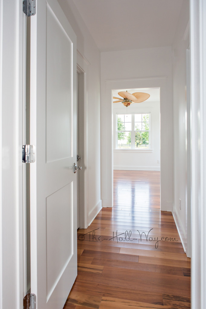
The Master Suite is on a small hallway off the Dining Room. Around the corner is another hallway with the “Hers” closet and the Master Bath with the Bedroom beyond.
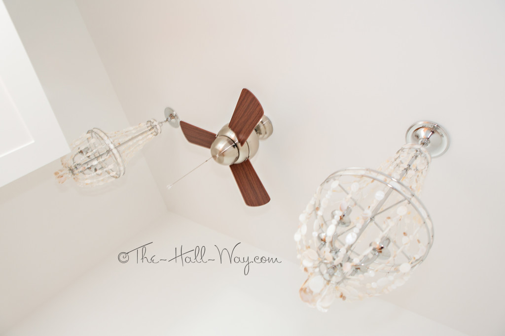
Mom went all out in her closet with 2 seashell chandeliers and a tiny ceiling fan!
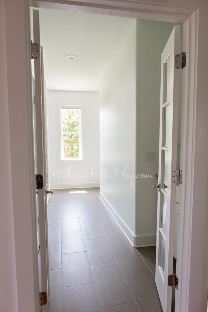
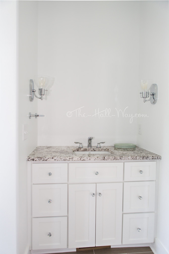
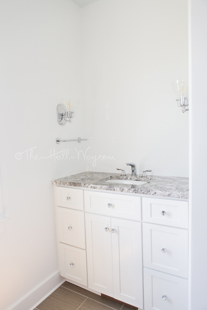
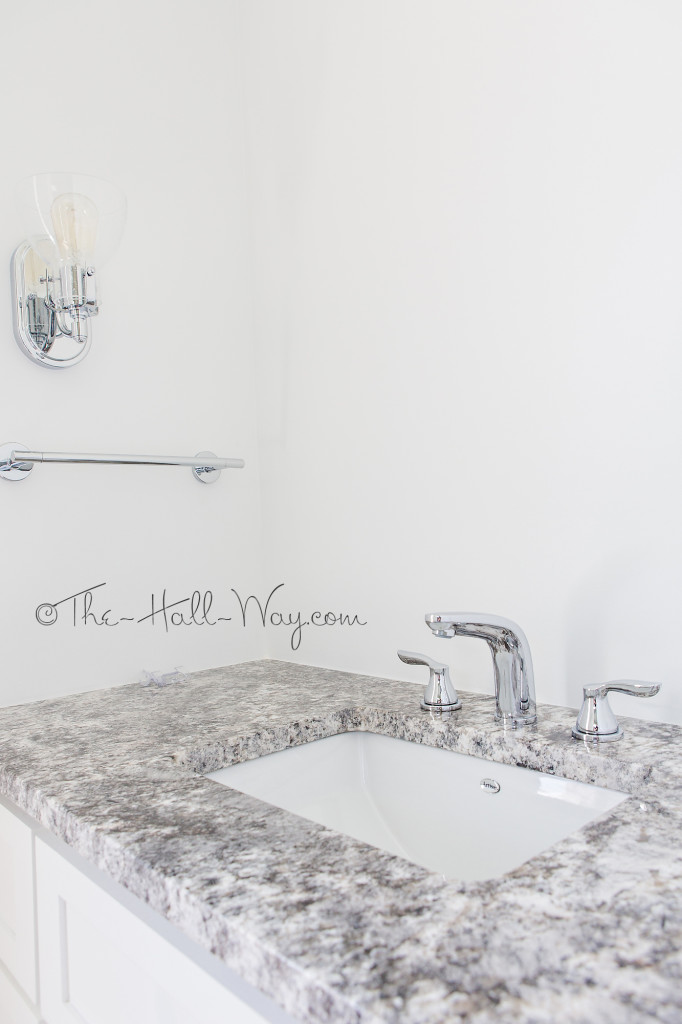
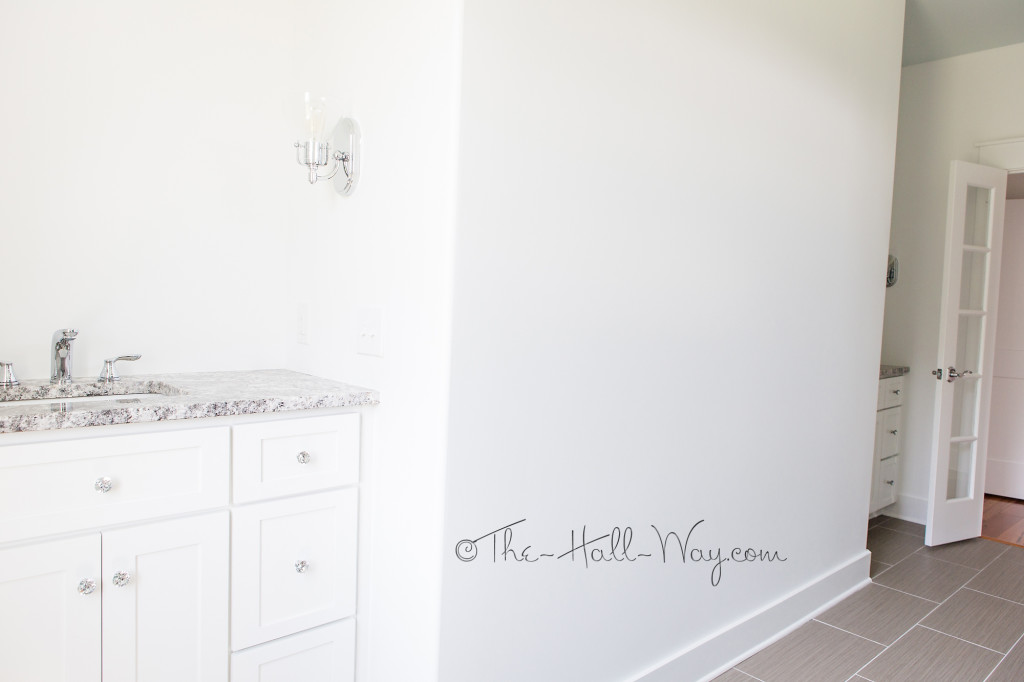
Across from Her closet is the Master Bath. The separate vanities are along the right wall.
The vanities are almost identical except “His” is several inches taller.
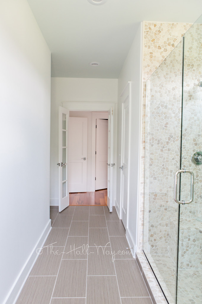
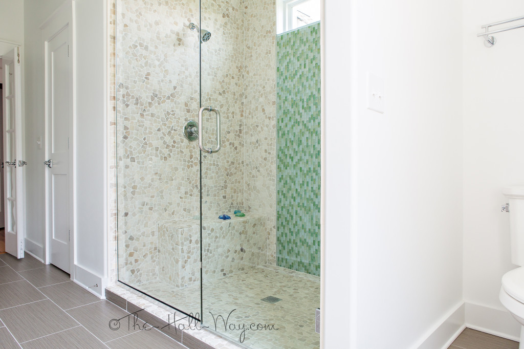
Along the opposite wall is “His” closet, the massive shower and the toilet. The floor tile is from Costco.
The shower has onyx pebble tile, green-blue glass mosaic tile and 3 shower heads.
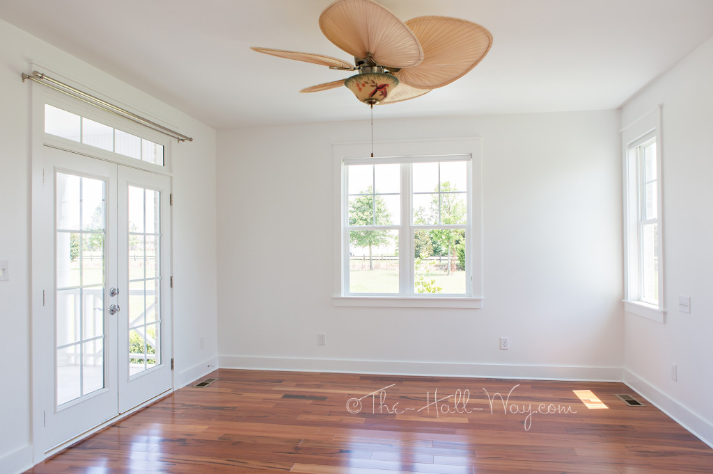
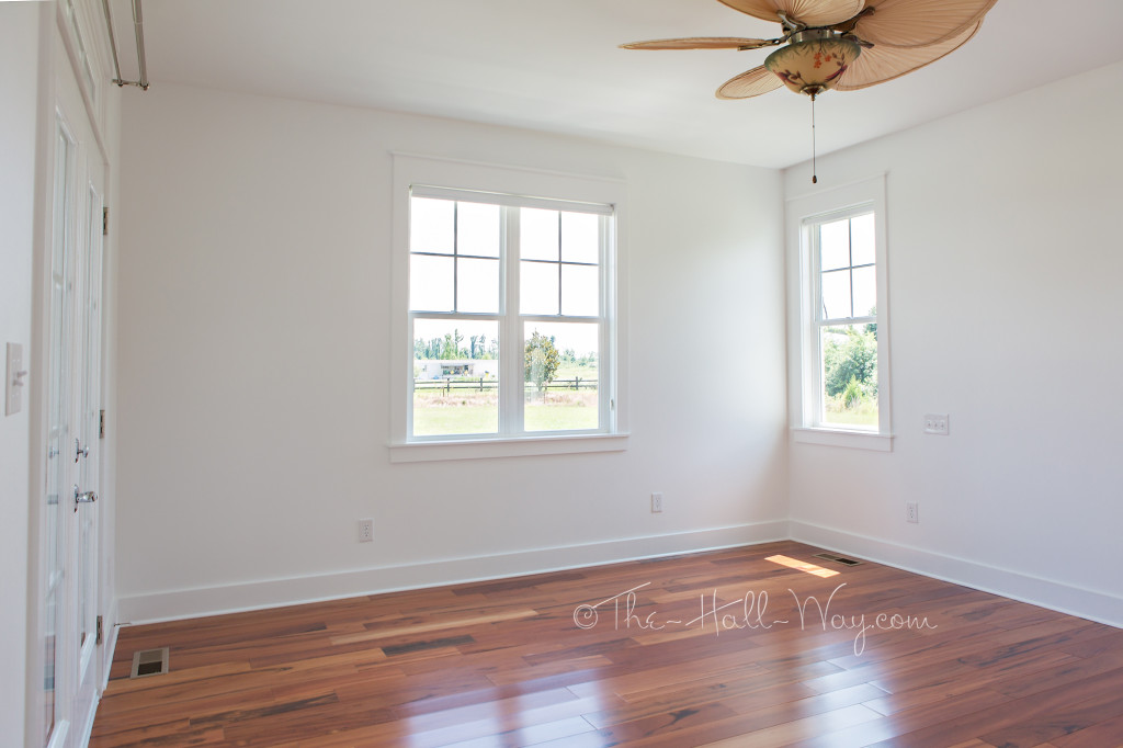
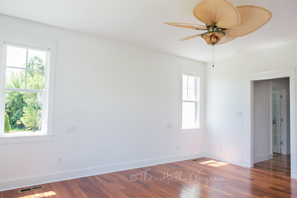
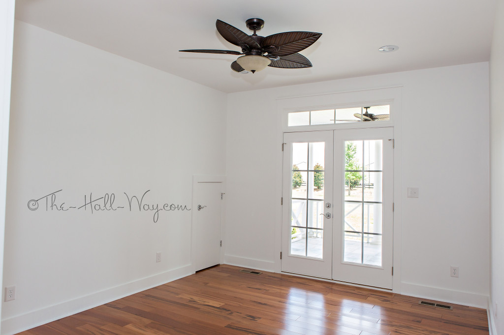
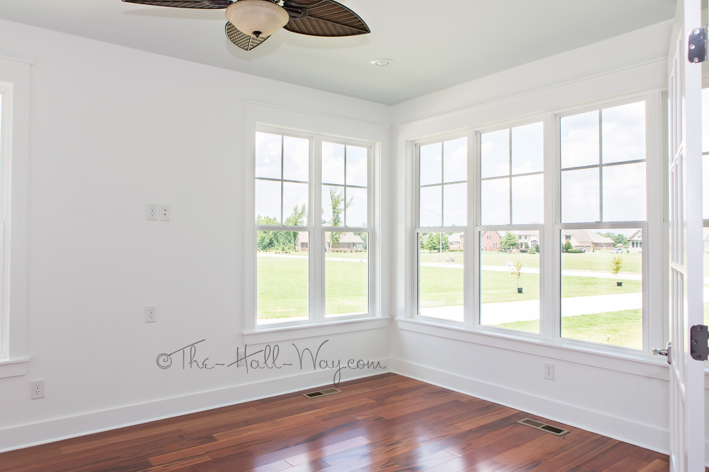
The Master Bedroom isn’t huge, but it has double doors onto the side porch which it shares with the office.
Check back for the final post of our Eastover Cottage tour!
Eastover Cottage – The Kitchen
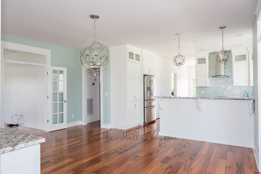
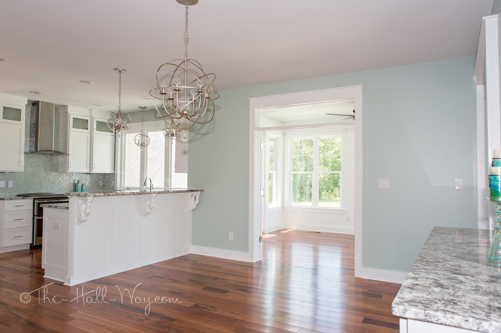
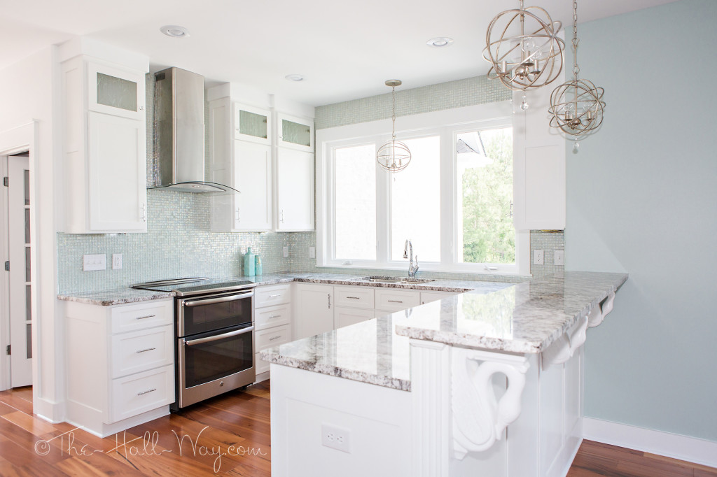
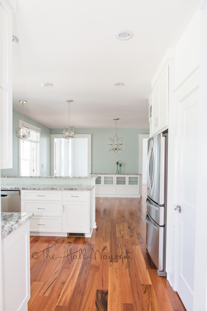
We’ve seen the Exterior and the Main Living areas, so here is the Kitchen of my parents’ new Southern Living Eastover Cottage. Below was taken near the Sunroom doorway with the Office on the far left, the Master hallway and the Kitchen.
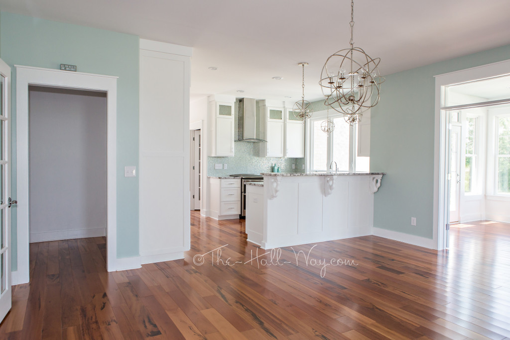
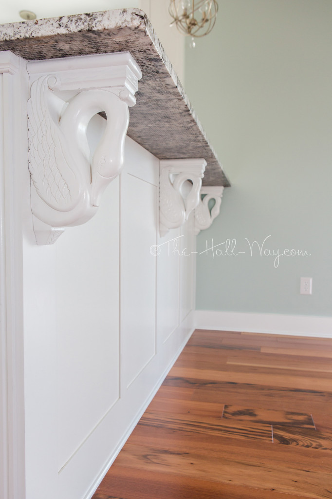
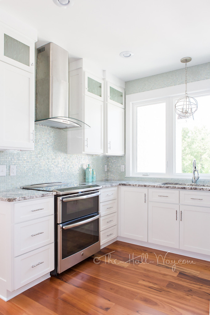
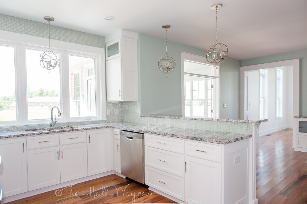
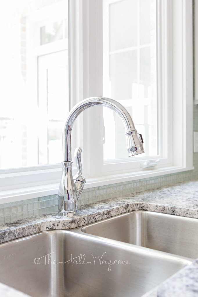
Mom designed the Kitchen with bamboo glass accent cabinets, stainless steel GE appliances, a clear glass mosaic backsplash, granite counters, swan corbels and bamboo pulls. The walls are Sherwin Williams Copen Blue (SW 0068) and the white is all SW Extra White (SW 7006).
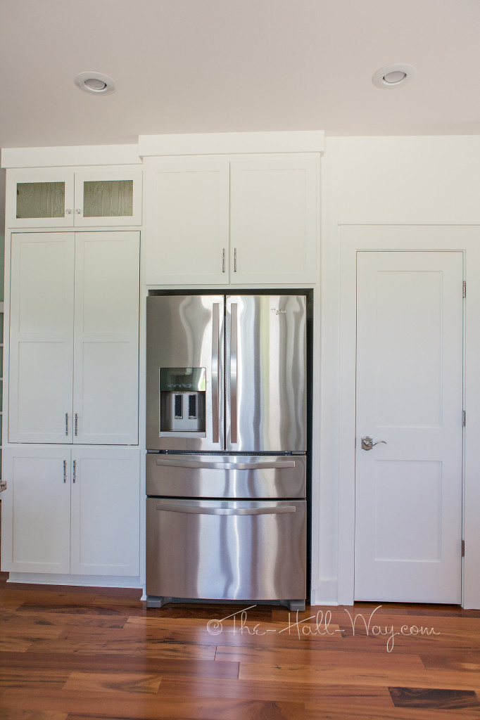
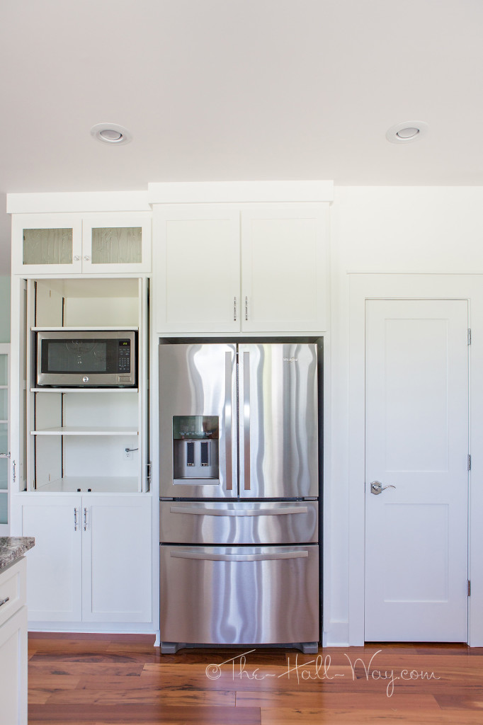
The walk-in pantry is to the right of the refrigerator.
To the left of the fridge is an appliance cabinet.
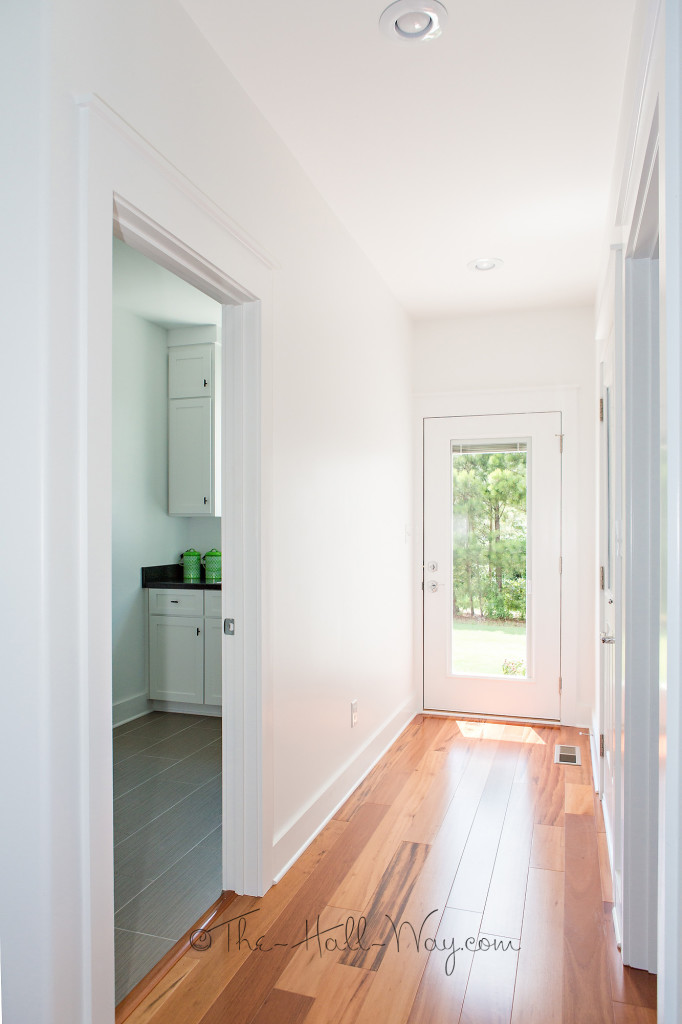
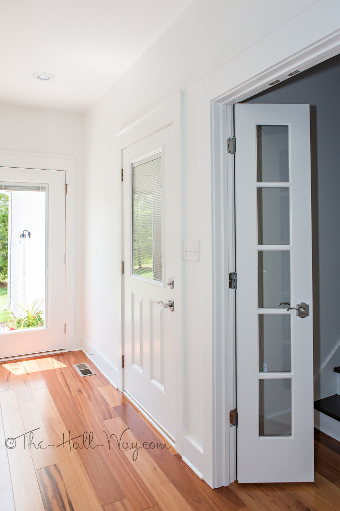
Beyond the Kitchen is the back hallway. The Laundry Room is on the left and the doors to the Garage and Bonus Room are on the right.
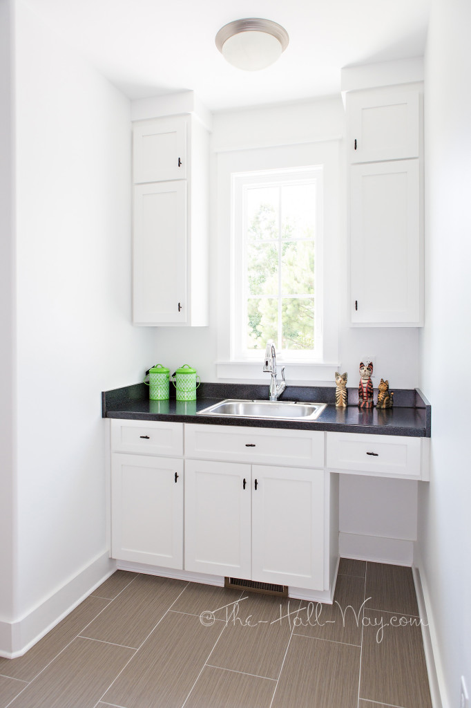
The Laundry Room has cabinets with space for the cat litter.
More pictures to come!
Eastover Cottage – The Main Living Area
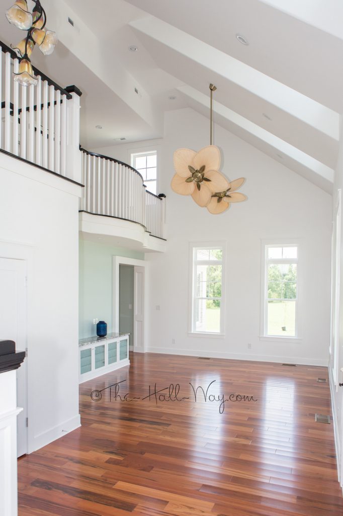
My last post featured the exterior of my parents’ new home – the Southern Living Eastover Cottage plan. Now, let’s take a look inside!
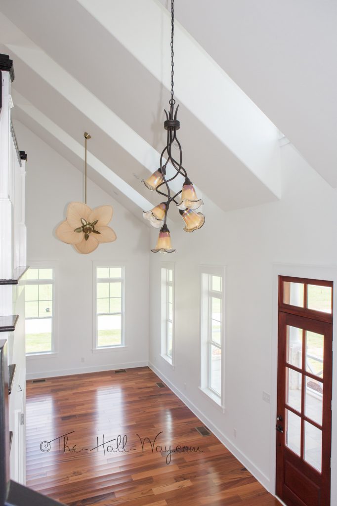
They kept pretty close to the original floor plan with the exception of the back part of the house. They did remove the wall between the Foyer and Living Room so it is all one big space. The screen porch is now a sunroom.
The master bathroom has a walk-in closet where it shows the toilet. There is no tub, so there is a large shower in it’s place. The toilet is on the far end where it shows the shower.
The Laundry Room and Back Hallway wall is even with the rear Master Bathroom wall. The garage is where the back porch is drawn with the bonus room staircase there as well.
Upstairs, there is a jack-and-jill bath connecting the 2 bedrooms. They each have a walk-in closet where the doors to the bathroom are drawn below. There is also access to the attic spaces.
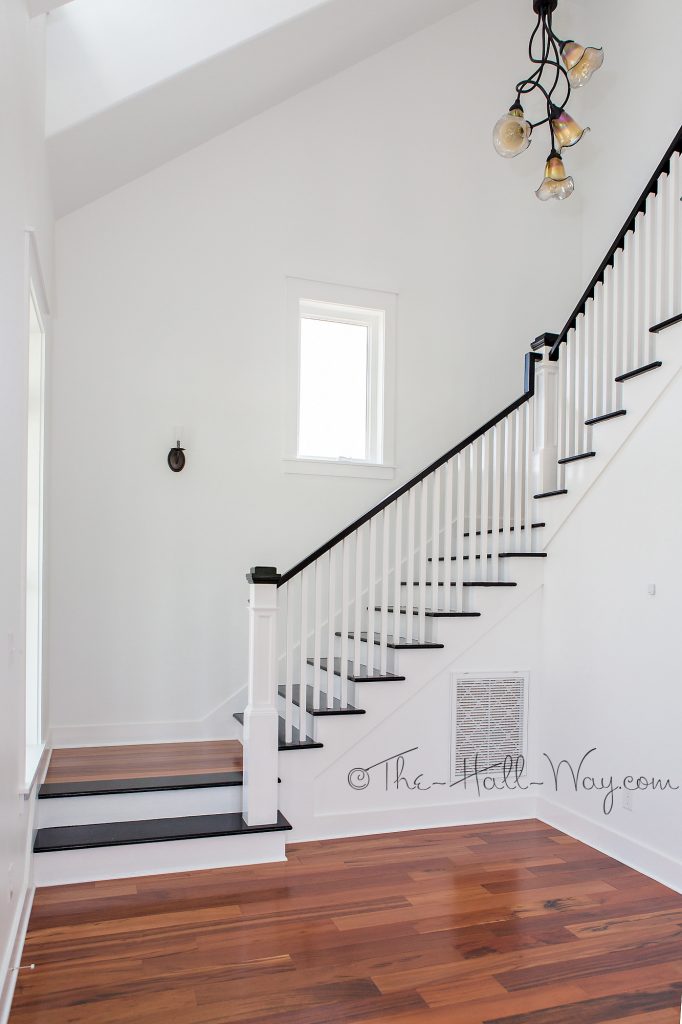
 The staircase is just to the left as you come in the front door.
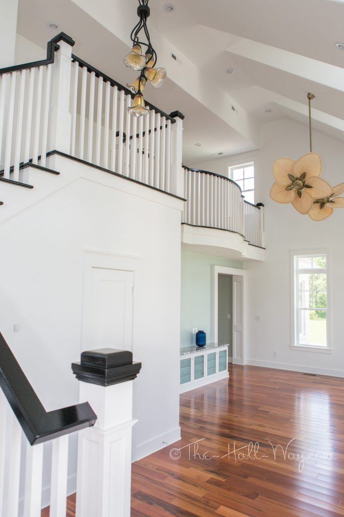
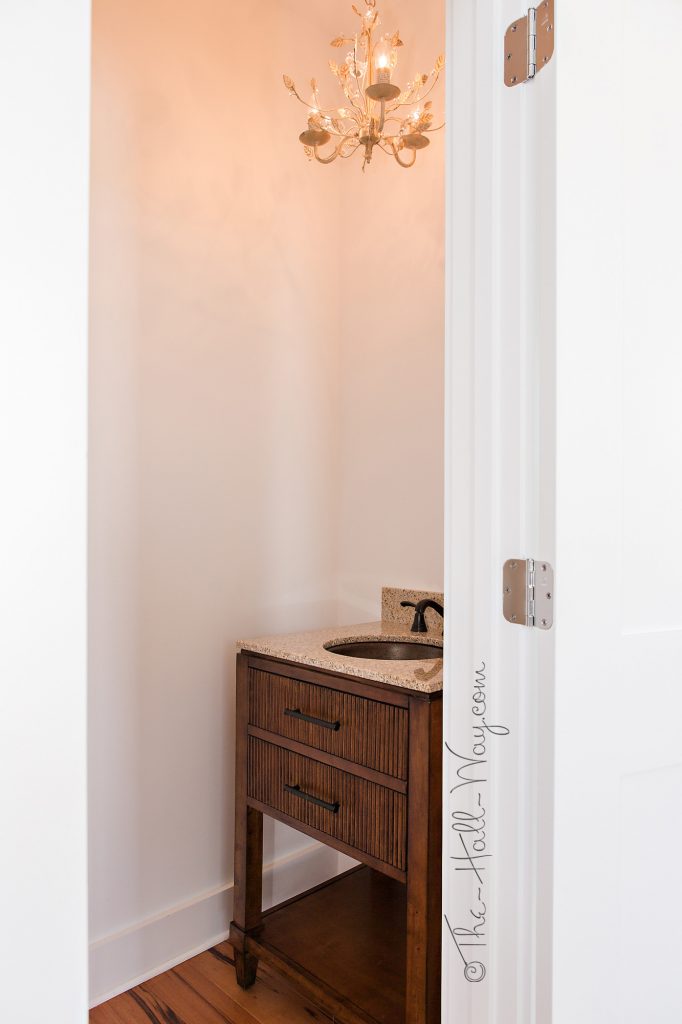
That is open to the Great Room. The door to the powder room is under the staircase.
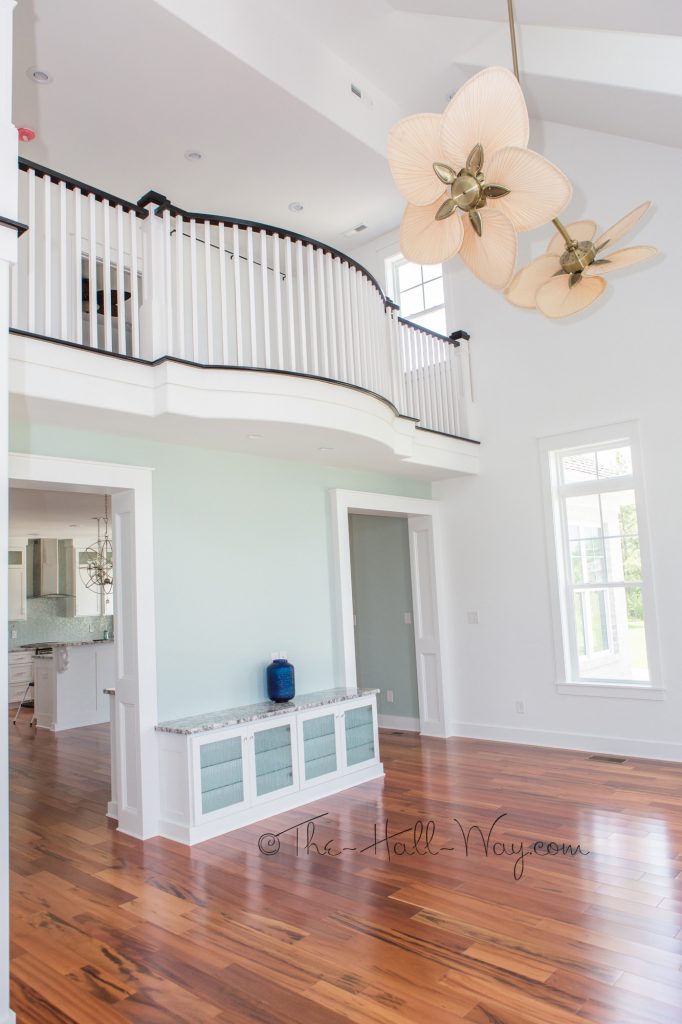
The floors are Brazilian Koa.
The Powder Room is small and near impossible to photograph, so here’s a quick glimpse.
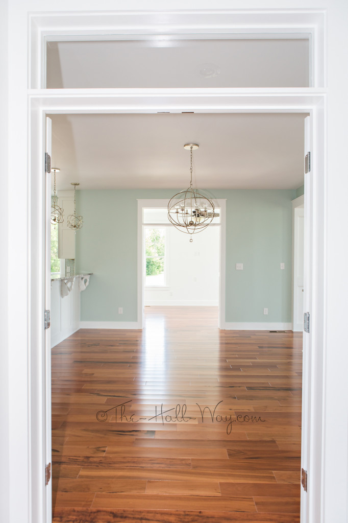
Instead of a fireplace, they have built-ins on either side of the wall between the dining room doorways. That wall is painted Sherwin Williams Copen Blue (SW 0068).
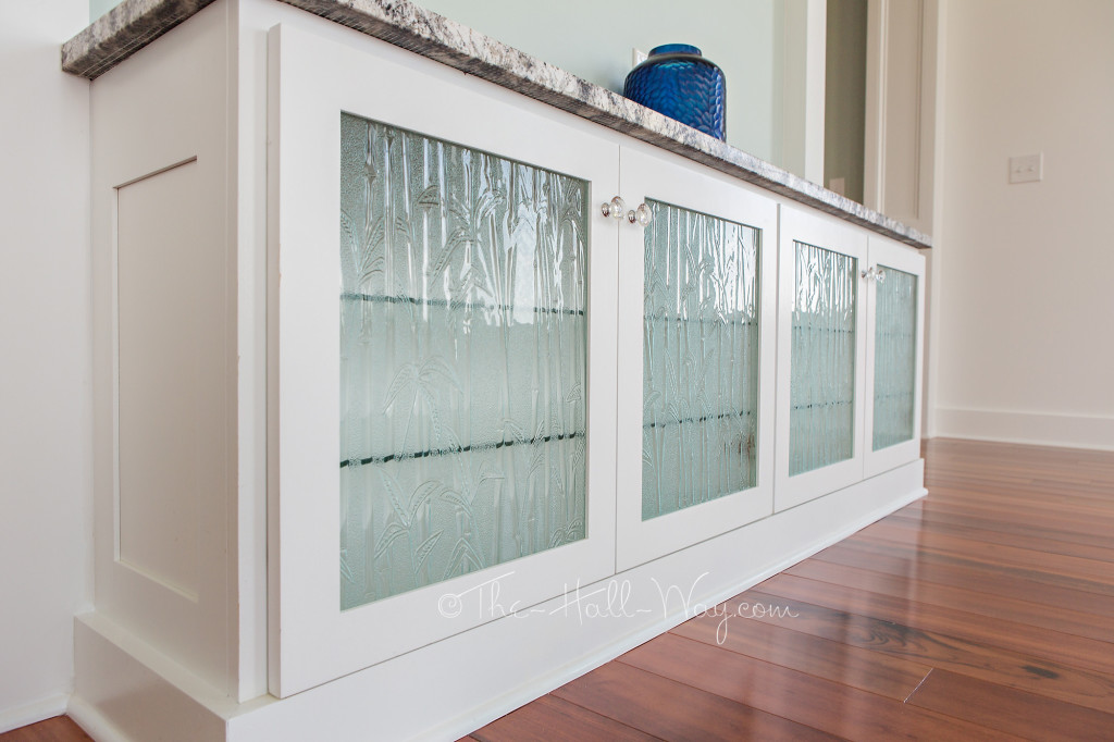
All the glass cabinets have a bamboo design.
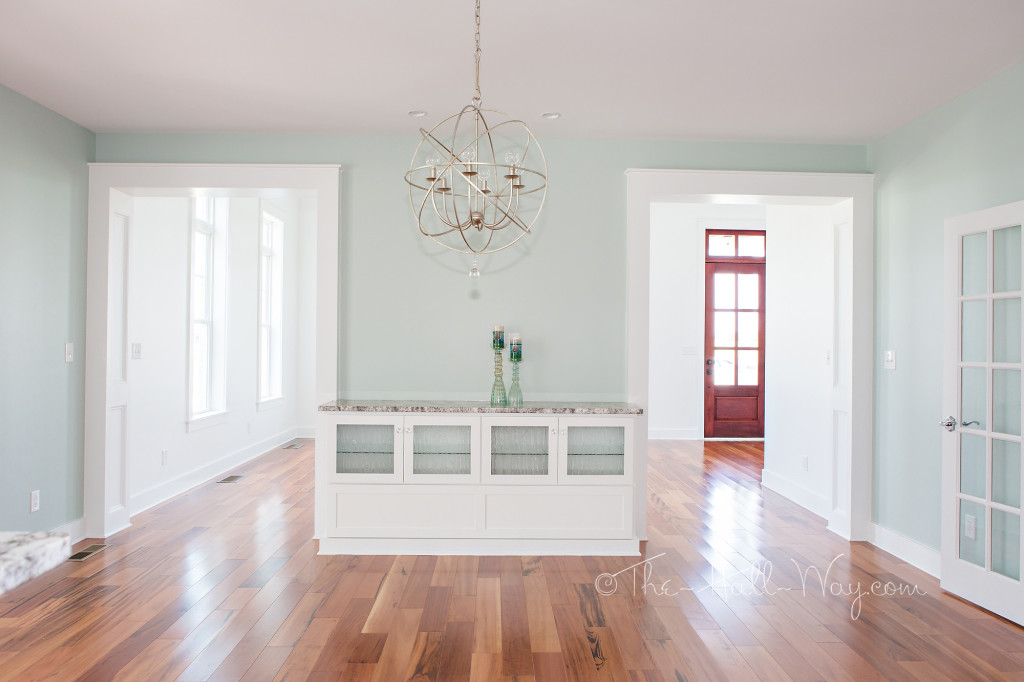
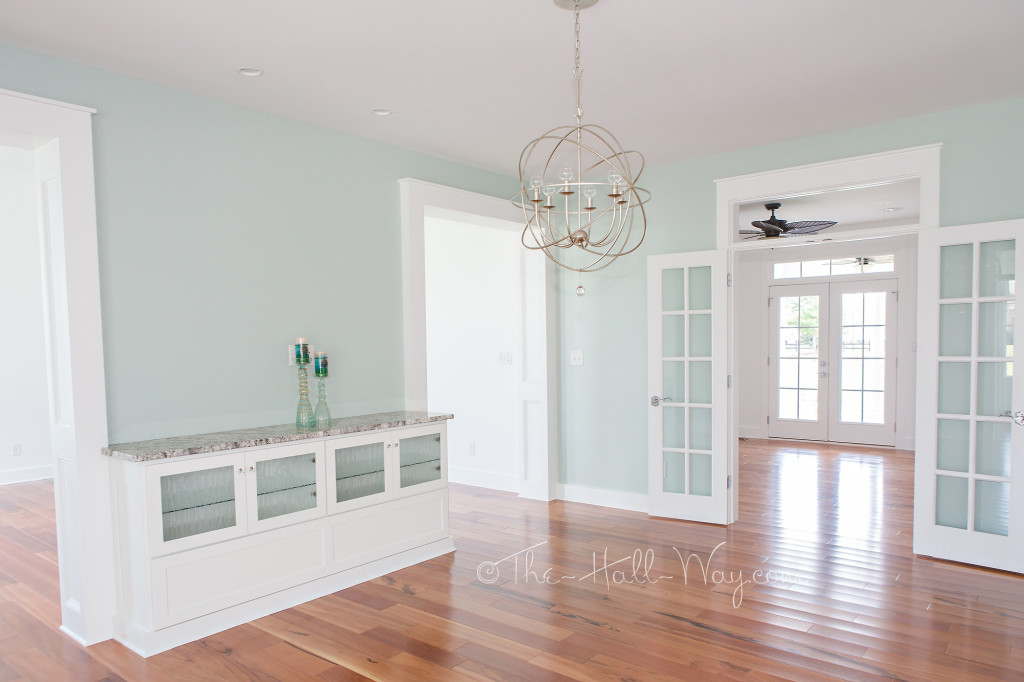
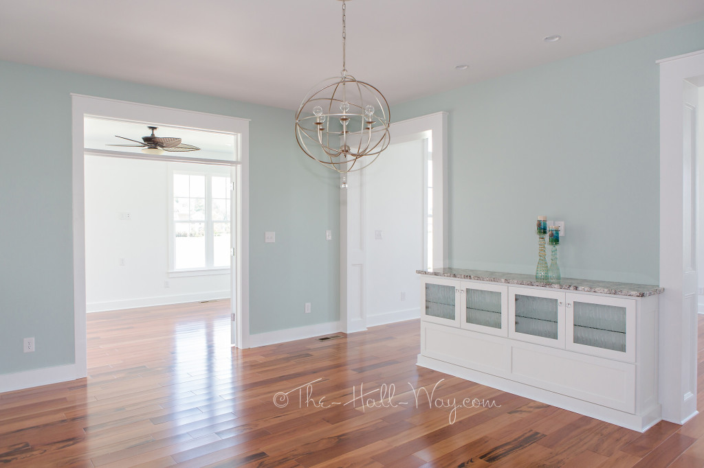
On the other side of that wall is a similar cabinet in the dining room with storage for table leaves.
On one side of the Dining Room is the Office. . .
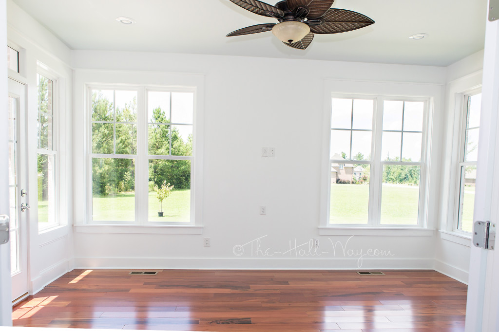
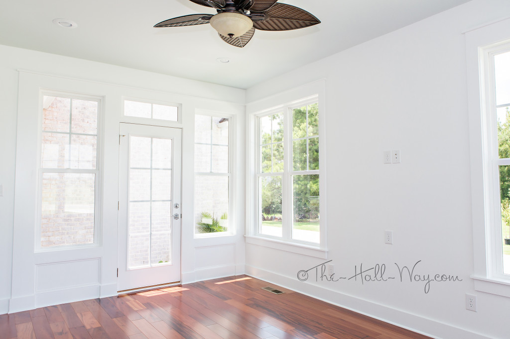
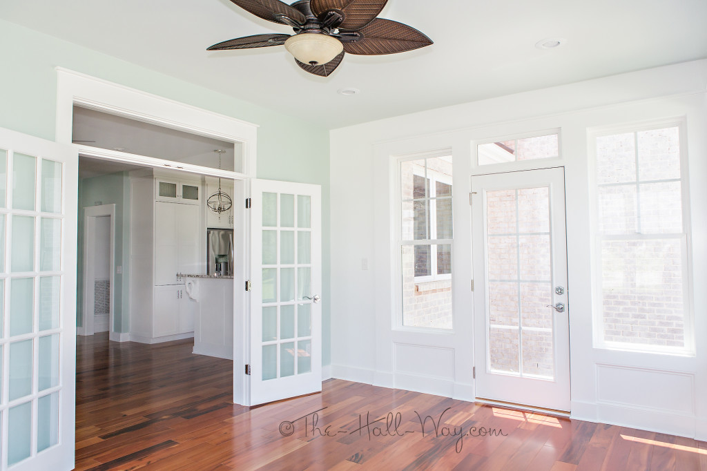
. . . and the Sunroom is on the other side.
The Office has french doors to the side porch and a small access door to storage under the main staircase.
Looking from the Office across the Dining Room into the Sunroom.
The Sunroom also has french doors off the dining room.
This door leads to a small patio off the driveway.
Next, we’ll take a look at the kitchen!
Eastover Cottage – The Exterior
My parents moved into their new house this week after a 9 month building process. The neighborhood is restricted to Southern Living home plans, so they chose the Eastover Cottage which was built by Preston Builders. It is quite a change from the mid-century lake house they lived in for the past 20+ years. This is also their first time living in the South. My mom loves the Coastal style, so the house is very light and airy.
I ran over and took a bunch of pictures before they moved in. (I may post some updated ones at a later date as some details were still missing – mirrors, hardware, etc and after she’s had a chance to decorate some). First up – the exterior.
The outside is pretty close to the original plans. Most of the house is a white brick that looks like it is covered in sparkling snow when the sunlight hits it. The porch siding is Hardie composite siding painted SW Extra White. All the trim and upper siding is white vinyl. The shutters were custom made and painted SW Sea Salt. The front door was custom made as well and stained to compliment the Brazilian Koa floors inside.
This side porch opens from the Office and Master Bedroom.
The original floor plans do not include a garage, so the back was modified slightly to include a 3 car garage with storm shelter and bonus room above. The storm shelter is under the bonus room stairs and is accessed from inside the garage.
The side screened porch from the original plans was turned into a enclosed Sunroom.
The porch floors are covered in white tile.
Check back for a tour of the interior!
A BM Revere Pewter Alternative
We finished our current painting project a couple weeks ago, so I took the opportunity of The Kid’s birthday party and our clean house to finally take pictures. As mentioned before, I chose Behr Premium Plus Ultra Sculptor Clay (PPU5-8) for the main living area of the house of these choices:
It is a very close match to Benjamin Moore’s Revere Pewter which is extremely popular. I’m not crazy about BM paint in how it goes on or cleans and Behr Premium Plus Ultra from Home Depot is our current favorite. It covers extremely well and is easy to clean which is essential with 2 dogs and a kid. We’ve repainted the foyer, hallways, family room, kitchen and mud room including all the trim and ceilings which are now Behr Silky White.
I really want to replace the foyer light with something chrome, but I’m having a hard time finding something I like with a price I can justify. It’s hard since it’s a very visible spot.
I have a new, brighter fixture for this hallway, but I’m having a hard time finding a clear glass shade to go on it that is the right size.
Here’s a before picture although it’s hard to see how big of a change the new colors made in a picture.
After:
Here’s the kitchen before:
And after:
Here’s a picture of the Mud Room with the old colors.
The lighter, more neutral wall color along with the much whiter trim makes it so much brighter and “cleaner” in here. Painting everything including the ceilings has been a major pain, but we always think it’s worth it when we finish each room.
Next on my list is our bedroom, The Kid’s room and the Dining/Piano room. I’m looking all over for bedding which will get me pointed in a design direction for the bedrooms. I think I’m going to use a darker steel blue for the piano/dining room.
The trim on the left is the new color, the trim on the window is the old ivory color. Here’s the room in it’s current state:
I’ve been trying to decide whether to add wainscoting, trim detail to the ceiling or both. I just feel it needs something to jazz it up a bit. A new chrome chandelier is on the list once I find one. I also want to find a couple accent chairs for the space.
Meanwhile, we replaced the wire shelves in the Kid’s closet with more solid shelves which increased his storage by a ton. I also need to finish up a special project I came up with for his room. More on that in a future post.

