Elevations And Renderings
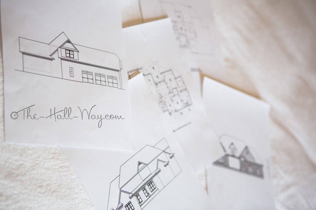
We finally got the first draft of our elevations this week. I had been worried about how they would look, but they look pretty good. Most of what needs changed is minor and, hopefully, he can start working on finishing them up now. We may meet with him and the builder next week so he can work on them with us all there for input. He also sent us the electrical plan. I need to look over the details, but it’s pretty similar to what I had sent him. I need to spend some time making sure everything is where we need it, but I’m not to worried about it. As long as the plans are close, we should be able to adjust the exact locations on site.
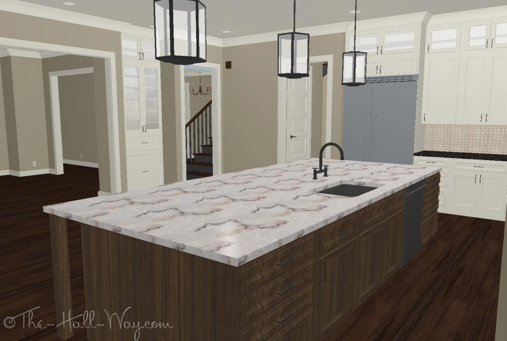
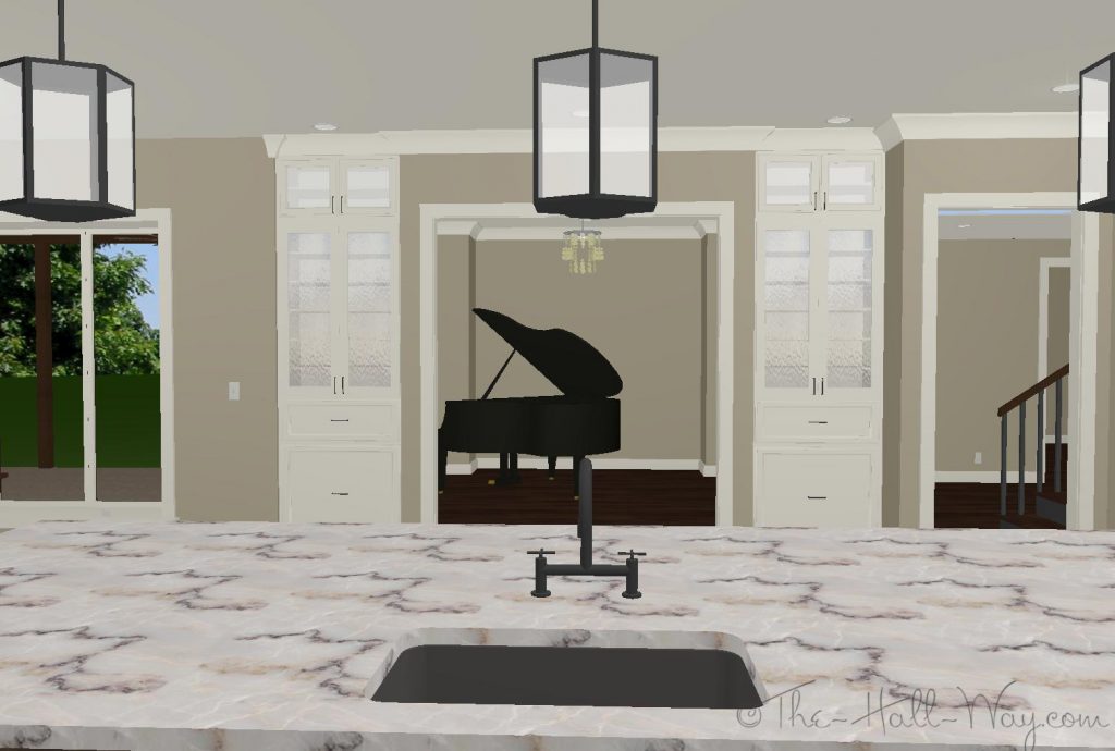
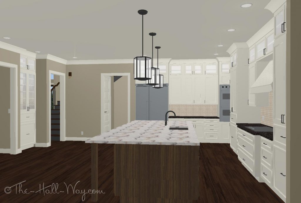
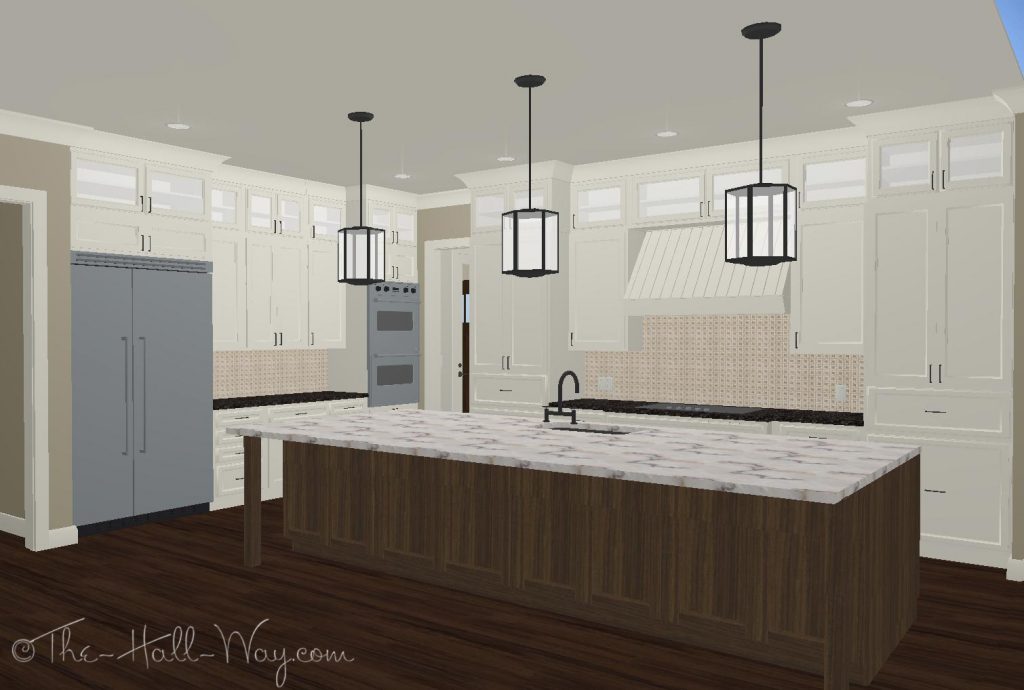
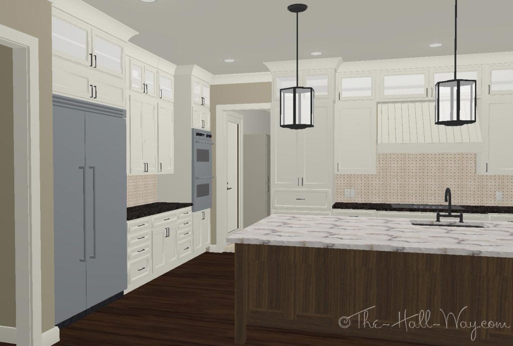
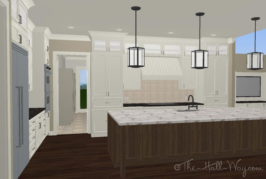
Yesterday, I spent some time working on the kitchen layout in my program. I tried to make it look as close to how I want it as possible although some things still look odd because of the limitations of my program.
All the fixtures and hardware are supposed to be polished nickel, but for some reason, the program renders them black which I don’t like.
Originally, the ovens were on the far right of the cooktop. We will probably have the microwave above the wall oven and that seems far from the fridge to me. (We will move things from the fridge to the microwave more than we will from the stove to oven.) We could move the microwave/wall oven to the left of the stove, but I don’t think that will look right. I decided to try moving them to the corner on the wall with the fridge and I think I like that better. We can use the counter between them or that end of the island for baking. It’s still not too far from the cooktop, when needed.
The mud room is through the door straight ahead. The doors to the garage and laundry room are just on the other side of that doorway. I don’t have a roof on this version which is why you can see the sky on the far right.
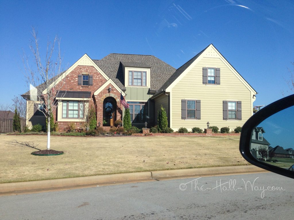
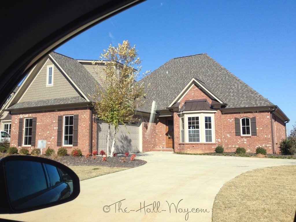
Today I drove through a neighborhood of craftsman style houses similar to how I want ours to look. I wanted to look at the brick colors and window styles. I really like the brick on this first house and the other colors are not to far from what I want to use on ours (will probably go a little darker with the paint though).
I think the brick on this one might be the same. Also has a similar green on it. I know who the builder of these houses is, so I may be able to find out exactly what brick was used.
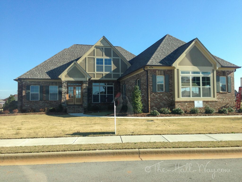
This also has green on it, but the brick is less red and has more variation. Another possibility . . .
I’ve been trying to figure out what to do with the windows. I hate grills on the windows because they interfere with the view and make the house feel more closed in. All of our houses have had the Colonial grills (see below). We are always surprised when we walk into a house without grills because it feels so much brighter and more open. I know for sure that I don’t want any grills on the back or side windows. Our current design has grills on just the top pane like the Half Colonial below. I’m leaning towards changing it to the Three Over One or Two Over One for a simpler design.

The windows on the front of the house aren’t ones we will spend a ton of time looking out, but they will be our view to the street and driveway. Another consideration is that the house will be almost 200′ from the road and the windows will be Low-E which makes them reflective, so the grilles might not even be noticeable from the street anyway. If that’s the case, we could possibly just leave them all without grilles. I need to keep looking when I drive around to decide what will look the best.

