Perspective
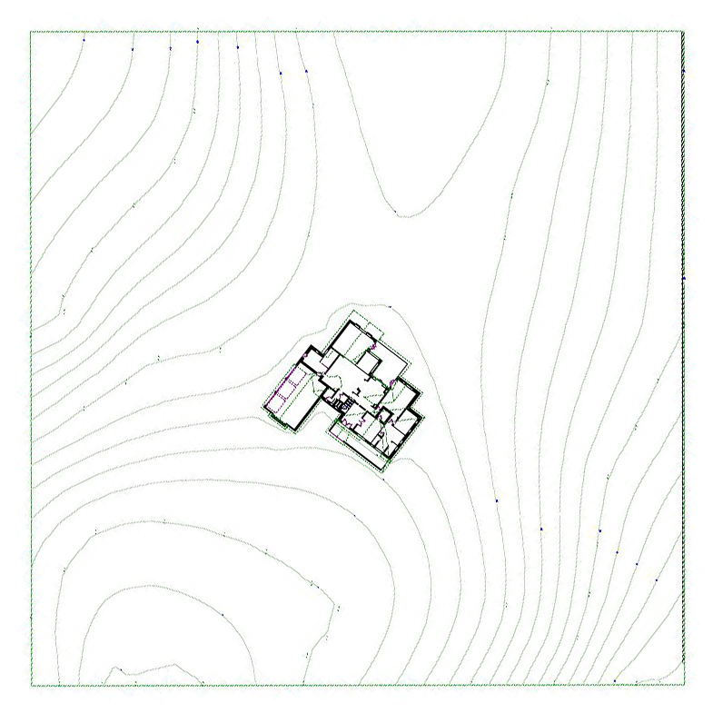
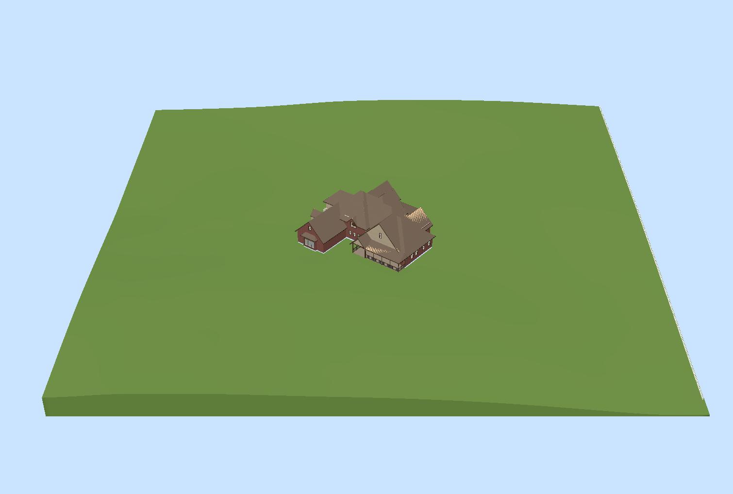
I’ve been wanting to do this for a while. I imported a terrain map of our property into my house design program, then marked elevation points along the lines. The program uses the points to draw the terrain. Then I pasted one of my house plan models onto it so we could see how the house looks sitting on 4 acres. We have thought that the house was huge so we were surprised at how small it looked on the model. David didn’t believe the land and the house were at the same scale (they are). The land is 417′ square, the house is approximately 84′ wide by 80′ deep.
The position of the house is estimated, of course. We’d like it to be just forward of center at an angle to the road (the road is on the bottom, south side). Ideally, we’d like it angled a bit more for the view out the back, but we don’t want it to look strange from the road. All of that will be figured out later. Below is a (very rough) rendering of the house on the land. Since I’m not an architect and my software is limited, it’s near impossible for me to get the roof lines to look exactly the way I want, but you can get an idea of the scale. (I even included the neighbor’s new white fence on the east (right) side).
The topography of the land seems to be pretty accurate. I can now use this file to mess around with driveway and landscaping ideas. After seeing this, we really want to get out there with a long tape measure and some stakes so we can stake out the house and see how it looks. Because of the hills in the road, there’s a specific point where we’ll have to put the driveway so we can see both ways. I’d like to measure where that point is so I can put it on this rendering too along with the location of the remaining trees. We’ve had a ton of rain lately though so it’s hard to say when we’ll be able to walk out there again.
Meanwhile, you probably noticed that things look a little different here 😉 I’ve done a complete redesign of the blog in an attempt to make it easier to navigate and more efficient to edit and view. The old design looked great, but I had a lot of problems posting with it and it was often very slow. The new design is a bit more traditional, but it seems to be working better and I have it pretty close to the way I want it. It seems to be running faster, but I’m still having the occasional problems with it loading. If you ever try to view it and get error messages, just hit Refresh or try again later. Hopefully, I’ll be able to work out all the kinks so it will load quickly every time. For now, enjoy the new layout!


